
Gone are the days of creating two storyboards files in your iOS project. A storyboard can have one or more scenes and each one represent the app’s user interface or view. So one storyboard is needed for creating the app’s user interfaces and they are automatically displayed on iPhone and iPad devices. The key to making that automation work, is to use the two Interface Builder tools: the Size Classes Control and the Auto Layout bar.
In the first half of the workshop, I discuss both tools, and in the second half you learn how to use the Size Classes Control and the Auto Layout Bar in an iOS application. Before you begin, I assume the following:
1. You installed the latest beta version of Xcode. Currently it is Xcode 6.1 beta.
2. Created an iOS project called Workshop28 in the Documents/Interactive Swift Programming folder on your iMac.

3. You know how to use the Assistant Editor to preview the storyboard in the iPhone and iPad device.
4. You read workshop 27.
The Size Classes Control
In Xcode 6, you create a new iOS project by selecting a template and provide options for the project, as usual.

Xcode takes care of setting up the project files and folders and displaying them in the Project Navigator panel for you. One of the file Xcode create is a single storyboard file called Main.storyboard. When you click it, Xcode load it in Interface Builder.

The size classes control is located at the bottom of the storyboard canvas and it look like this:
It shows a default size class. So wAny = width Any and hAny = height Any. This size class represents the size and orientation of a generic layout of a scene.
 A scene represents the app’s user interface or view. A storyboard canvas can have more than one scene-each representing a different user interface. So if your app need three user interfaces, you’ll have to add two more views on the storyboard canvas and connect them via a segue (pronounce seg-way). A segue specify a transition from one scene to another scene. On a storyboard canvas, a segue look like this:

The Size Classes Tool
When you click the size classes control, Xcode display the size classes tool. You use its pointer to select a size class, and each one comes in three sizes: Regular, Compact, Any. When you use the the size classes tool pointer to select a size class, Interface Builder respond by changing the storyboard canvas layout to reflect the size and orientation of an iOS device.
For example, the image below shows the generic size class, which produce a generic iOS device layout.

Apple recommends you select the generic size class and use the layout it produce, to design the application’s user interface. Take a look at images below, they show size classes you can select from the size classes tool and how they change the layout of the storyboard canvas. You can think of them as seven different layouts within a single storyboard file.
 |
Changes made to views and constraints apply exclusively to the layout a size class produce. For example, say you selected the generic size class and added views on the layout it produce. Now, you want to add constraints only to the iPhone device, in portrait orientation. You’d have to do the following:
- Select the Compact Width | Regular Height size combination from the size classes tool.
- Modify the layout views, if necessary.
- Add constraints to the layout.
- Preview the storyboard in the Assistant editor to see if constraints you added to the layout created any layout issues for the iPhone devices.
- If previews of the iPhone devices in the Assistant editor previews revealed any layout issues, fix them in Interface Builder.
- Run the app in the iPhone simulators.
You will have to repeat step 5 and 6 until there are no more layout issues. In summary, the size classes control display the size classes tool, which you use to select a size class, and in turn it change the storyboard layout to an iPhone device, in Portrait orientation.
By the way, the iOS Simulator and asset catalogs fully support size classes. For example,when you launch the app you are developing in an iPhone simulator, the layout the size class produce automatically adapt to the appropriate iPhone size and orientation.
Auto Layout Bar
It is located at the bottom right corner of the storyboard board canvas and it look like this.
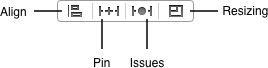
The auto layout bar is for adding constraints to a layout. It is also used for changing properties of existing layout constraints. The auto layout bar has four buttons and you use them to accomplish the following:
- Align. This button enables you to create alignment constraints, such as centering a view in its container, or aligning the left edges of two views.
- Pin. This button enables you to create spacing constraints, such as defining the height of a view, or specifying its horizontal distance from another view.
- Issues. This button enables you to resolve layout issues by adding or resetting constraints based on suggestions.
- Resizing. This button enables you to specify how resizing affects constraints.
Later on in the workshop, you learn how to use the third button on the auto layout bar.
Add Controls On The Generic Storyboard Canvas
Enough talk about the size classes control and the auto layout bar. It is time to use them in a storyboard. Start by launching the Workshop28 project you created earlier on. Click the Main.storyboard file to launch it in Interface Builder. By default, the storyboard canvas size classes control is set to the generic layout.
Use it to design the storyboard scene to look like Figure A below. In the File Inspector panel, make sure the “Use Auto Layout” and “Use Size Classes” checkboxes are ticked-see Figure B.
 |
 |
| Figure A | Figure B |
Now, add the image shown in Figure C, in the project. In the Attribute inspector, set the Image View’s Image attribute to the image you added in the project. Figure D shows what your workspace should look like after setting the Image View’s Image attribute.
 |
 |
| Figure C | Figure D |
Previewing The iPhone Devices In The Assistant Editor
Configure the Assistant editor window to preview the Main.storyboard in the iPhone devices-see the image below.
 Use pinch gesture on your track pad to zoom content in the Interface Builder window or the Assistant editor widow. Also, use the preview orientation button on a device preview to flip it to landscape orientation and vice versa. The button look like this:

As you can see in above portrait previews of the iPhones devices, there are layout issues. Flip the devices previews to landscape orientation and layout issues are present there as well. To resolve layout issues in portrait and landscape orientation, you have to do the following tasks.
Task 1: Change the size classes tool to the iPhone layout
Use the size classes tool to change the size class tool’s grid to wCompact wAny. Notice how the storyboard canvas change to resemble the iPhone device in portrait orientation.

Task 2: Add constraints to the storyboard views
Click the View Controller object, then click the auto layout bar’s Issues button. Select “Add Missing Constraints” from the pop up menu. Take a look at the portrait orientation of the devices previews, in the Assistant editor window. No layout issues there. Rotate the devices previews to landscape orientation layout. No issues in the iPhone 3.5″ preview, the iPhone 4″ preview, and the iPhone 4.7″ preview; however, there are issues in the iPhone 5.5″ landscape preview and it look like this:

You should run the app in the iPhone simulators to see what the app’s user interface look like. As you can see in images below, the app’s user interface look just fine in both portrait and landscape orientation on the iPhone simulators.

Task 3: Change the storyboard size class
Even though the application’s user interface look fine in landscape orientation in the iPhone simulator’s. You have to fix the layout issues shown in the iPhone 5.5″ landscape orientation preview. Start by changing the size classes tool to the size class grid shown in the left image below. By doing that, the storyboard canvas changed to the iPhone 5.5″ landscape layout.

Task 4: Identifying layout issues in the storyboard
Before I show you how to fix the layout issues for the wRegular hCompact size class, you have to identify layout issues on the storyboard. Interface Builder shows three layout issues for the size class you selected above.

Click each view on the storyboard scene and you will see a solid orange box around each one. They indicate that the views has no constraints.
Now, click the Start button view. See the dotted red box that appear in the upper left corner. Well, Interface Builder is letting you know that the view is misplaced and at run time it will appear at the location indicated by the dotted red box. In other words, when you run the app in the iOS simulator, the Start button view will appear at the location indicated by the dotted red square.
Click the Image View and Interface Builder display a large dotted red box on the left size of the canvas-see image below. It shows where the Image View will show up at run time.

Click the label view. It is located below the Image View. Interface Builder display a solid orange box around it and a dotted red box in the upper left corner of the storyboard. Again, Interface Builder is telling you that the label view has no constraints and where it will show up at run time.
Before continuing, you should run the app in the iPhone 5s simulator to see what the user interface look like. The app’s user interface should still look fine in portrait and landscape orientation.
Task 5: Fix the iPhone 5.5″ landscape layout issues
So, the orange boxes and the dotted red boxes indicate layout constraints issues. To fix them you will have to do the following.
Click the View Controller object either in the Interface Builder or the Document Outline. Next, select the Issues button from the auto layout bar. From the pop up menu, select “Add Missing Constraints”. Interface Builder adds constraints to all of the storyboard’s views and they appear as vertical and horizontal blue lines on the storyboard canvas. Also, the landscape preview of the iPhone 5.5″ device, in the Assistant editor no longer shows layout issues.
The iPad Layout Issues
So far you’ve added and fix constraints for these size classes; resulting in the application’s user interface displaying correctly on any iPhone device and in any orientation.

What you have to do now is add constraints to the iPad Size classes so the application’s user interface display correctly in the iPad simulators. As of now, the Assistant editor preview of the iPad device in portrait and landscape orientation look like images shown below. The app’s user interface will look the same in the iPad Simulators as well.

Fix The iPad Layout Issues
Before fixing the iPad layout issues, click the size classes bar. From the size classes tool, select the size class shown in the image below. The storyboard canvas change to reflect the selected size class.

Now, adjust the Image View so it stretch all the way to the right side of the View. Also, move the label view so that it is centered below the Image View. You are ready to add constraints to the iPad layout.
Start by clicking the View Controller object. Next, click the auto layout bar’s Issues button. From the pop up menu, select “Add Missing Constraints”. Voila! Layout issues disappear from the storyboard and the Assistant editor preview of the iPad device, both in portrait and landscape orientation. The application’s user interface display correctly in the iPads and the iPhones simulators as well.
That’s All Folks!
This is the end of Workshop 28 and in it, you learned how to: